A Transformative 12South Home Renovation
Attention-grabbing interior design relies on a keen eye, thoughtful detail and the ability to see a home’s potential. Such is the case for one beautiful abode in the popular and continually developing 12South neighborhood, where an inspiring renovation from interior designer Jessica L. Davis of JL Design breathes new life into a one-level, cottage-style former two-bedroom two-bath, infusing it with modern upgrades. Sitting pretty on nearly a quarter of an acre, the home is a collaboration between Jessica and architect Stephen Wells of Wells Design Associates — the unique interpretation of a transitional design that leads with color and texture while blending traditional and contemporary styles. Now expanded to a four-bedroom, four-bath stunner, it offers standout lighting fixtures, textured wall coverings, and shelves filled with intriguing books and curios that result in a worldly, collected feel.
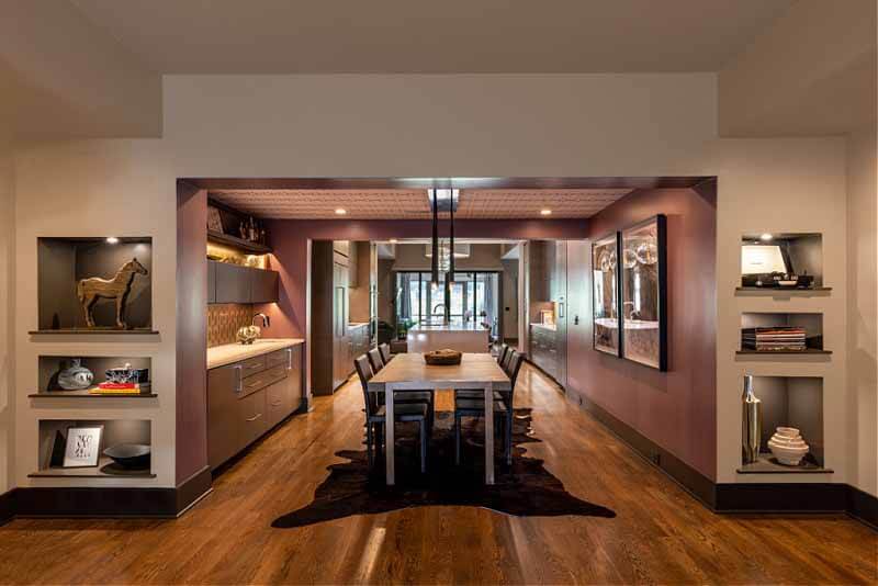
“The dining room is really the standout because it’s right when you walk in,” says Jessica L. Davis of JL Design. “You can’t even capture it accurately in a picture. It’s just magical to look from that entry straight through to the back of the house.”
Adding roughly 2,800 square feet to the home’s original footprint, the renovation took around two years to complete and included a remodel of the pre-existing space. The result? Each room of the home appears to have its own theme, with eclectic elements and carefully curated nuances around every corner. Working together, Jessica and her clients did a lot of front-end work to figure out the overall aesthetic. “We always start with a lot of discovery work,” explains Jessica of the lengthy and detailed process. “That includes a lifestyle questionnaire and a magazine exercise that helps us identify certain design elements that people are drawn to — things like lines, texture, symmetry, asymmetry and different color relationships.” As it turns out, the homeowners lean toward an eclectic look, straying from common colors such as gray and white. Instead, Jessica brought in rich colors like plum and deep blue, which she accentuated with warm, contrasting neutrals. Additionally, striking tile work and custom cabinetry added even more character to the 1920s home that happens to be under a historic overlay. “This client didn’t want anything that looked like what everybody else is doing,” says Jessica, “which was really fun for us to work on, quite frankly.”
The contrast of symmetry and asymmetry also plays an important role in the home’s design, with the architecture setting the stage for design elements that further that concept. “We’re always playing with symmetry and asymmetry,” explains Jessica. “It’s kind of this back and forth — very similar to the way that many designers will play with warm and cool tones. We want to try to balance those.”
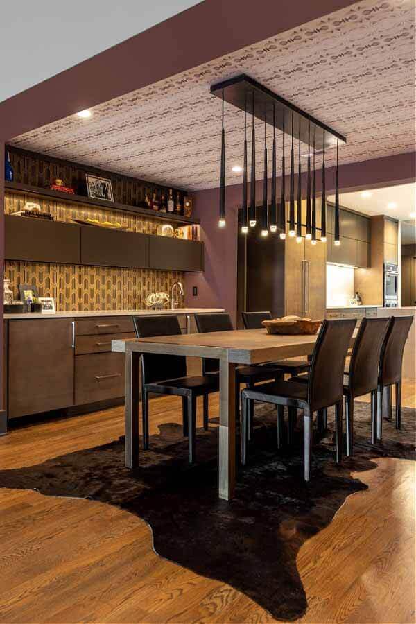
The eye-catching Eskayel covering that lines the dining room ceiling offsets the cozy plum-colored walls and intriguing light fixture. Layered cowhide rugs from Southeastern Salvage Home Emporium offer a rich foundation beneath the dining area.
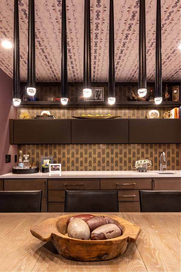
A primitive, rustic bowl from Merridian Home Furnishings displays mammoth multicolored stones that resemble dinosaur eggs.
RELATED: 5 Home Design Vignettes by Nashville Interior Designers
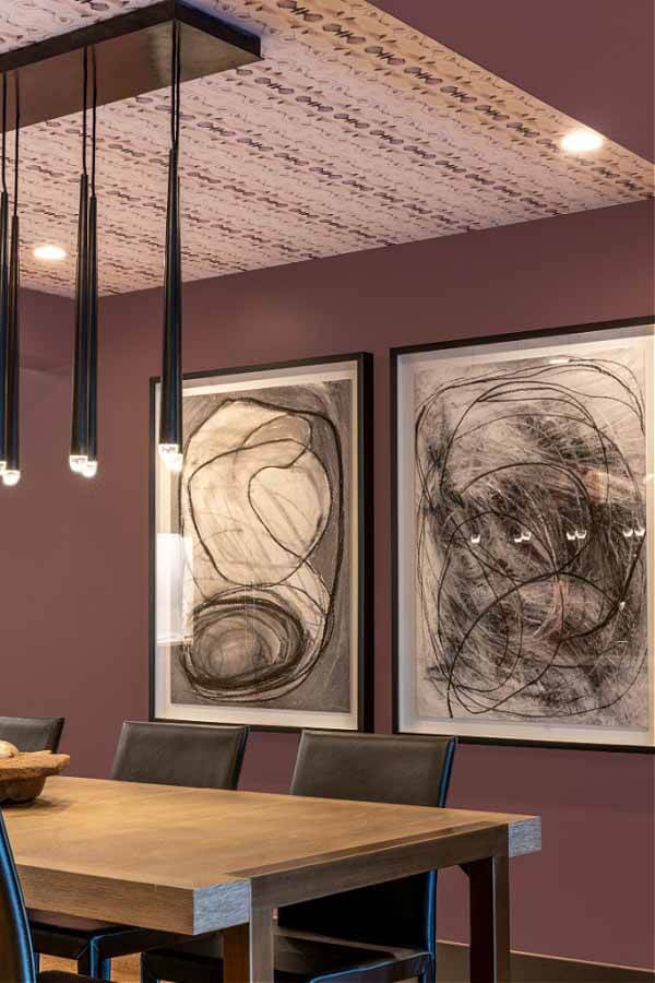
Art Deco meets modern. Limited edition art and lighting fixtures from Restoration Hardware stand out against the beautiful mauve hue.
The kitchen is noteworthy, with a vaulted ceiling and overhead skylights that immediately command attention. Flanked by painted strips in Sherwin-Williams Black Fox, it’s a dramatic presentation highlighting the features below. Seamless, high-end cabinetry guides the space’s layout, while a Caesarstone quartz island with waterfall edges provides a centering anchor. Overhead lighting fixtures from Rejuvenation add a more delicate element, while one side of the island boasts metal stools with carved walnut backings and leather seats that give off a touch of masculinity.
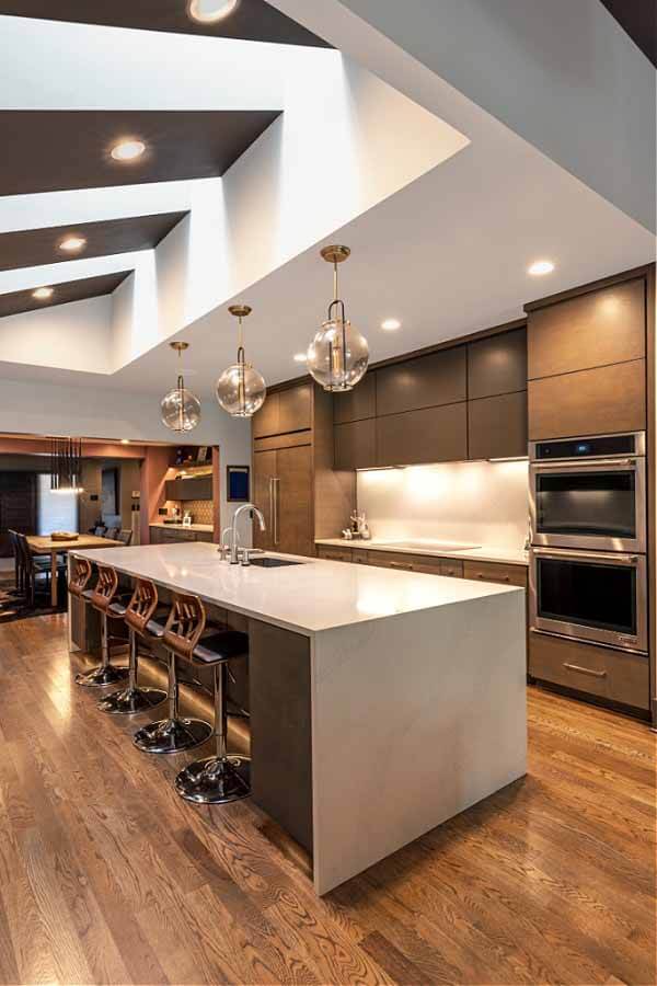
Though far from obvious to the naked eye, the statement-making skylights possess motorized shades to assist with ambiance and temperature regulation.
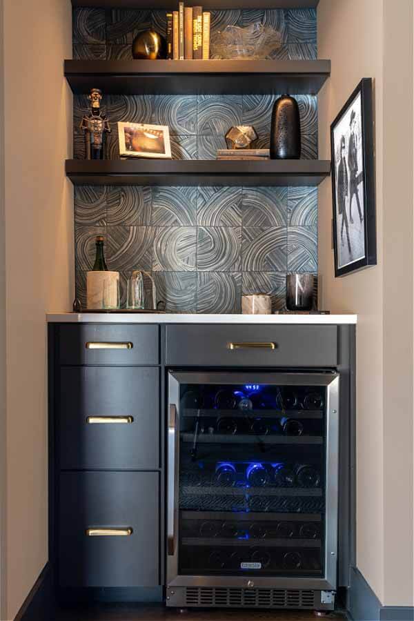
Abstract-patterned concrete tile from Ann Sacks, perfectly placed behind the wet bar, serves as wall art.
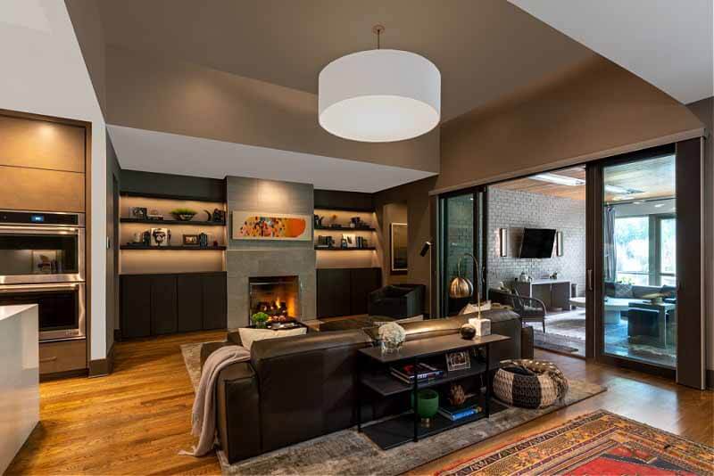
A large, custom-sized drum light from Fenchel Shades (that’s nearly four feet in diameter!) is the focal point in the living room. Original art by Trevor Mikula adds a pop of color above the fireplace. The whimsical piece is an acrylic impasto painting of a whale.
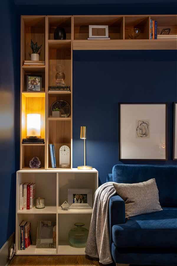
Opting for a cozy feel, the homeowner chose a soothing blue for her office walls. Though the modular built-ins may appear to be custom, they are actually from a company that originated in Denmark, called BoConcept. Mounted by a professional installer, they provide a wonderful sense of asymmetry to juxtapose the room’s architectural symmetry. A carefully curated selection of books and collectibles adds personality to the space.
RELATED: BEFORE & AFTER: A Must-See Renovated 1903 Victorian Home
With majestic lighting and a closet to write home about, the master bedroom is a sight to behold. Approximately 60 inches in diameter, the glamorous circular chandelier from YLighting, which is suspended above the bed, is an impressive and elegant piece that steals the show. Meanwhile, the closet offers a dreamy oasis — and enough space to relax for a while if you’re so inclined. “The Closet Company did the closet — the island and everything,” explains Jessica. “It’s a big closet, so one side is hers, one side is his, and the island essentially separates it.” In an effort to more effectively organize such a vast space, the homeowners also brought in Holly Trepka of NEAT Method, who created a structured setup for all of the clothing and accessories.
In the master bathroom, more design ingenuity awaits. The space particularly spoke to Jessica during the creative process, which is apparent in every detail. “I loved designing this,” she tells us. “When you walk in, the main focal point is the tub and an alcove of tile. I designed the tile accent in an upside-down triangle that’s all tiny glass mosaic.” Accented even further by a bold light fixture from British purveyor Timothy Oulton, the secluded spot offers an in-home retreat. The spacious shower adds to the spa-like feel, with a floating bench and his-and-hers showerheads. A combination of lacquer and rift-cut oak cabinetry surrounds the custom-cut plate-glass mirrors, embellished with brass knobs from Emtek.
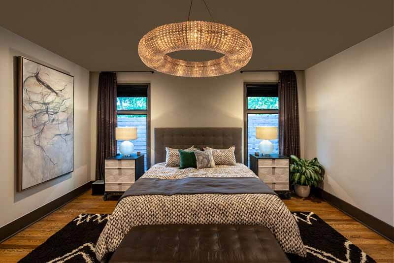
The master bedroom’s stunning chandelier from YLighting is the main attraction.
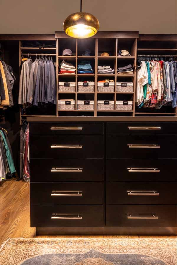
This closet layout from The Closet Company is inspiring. “This is just showing his side,” says Jessica of our view. “Her side has an antique vanity.”
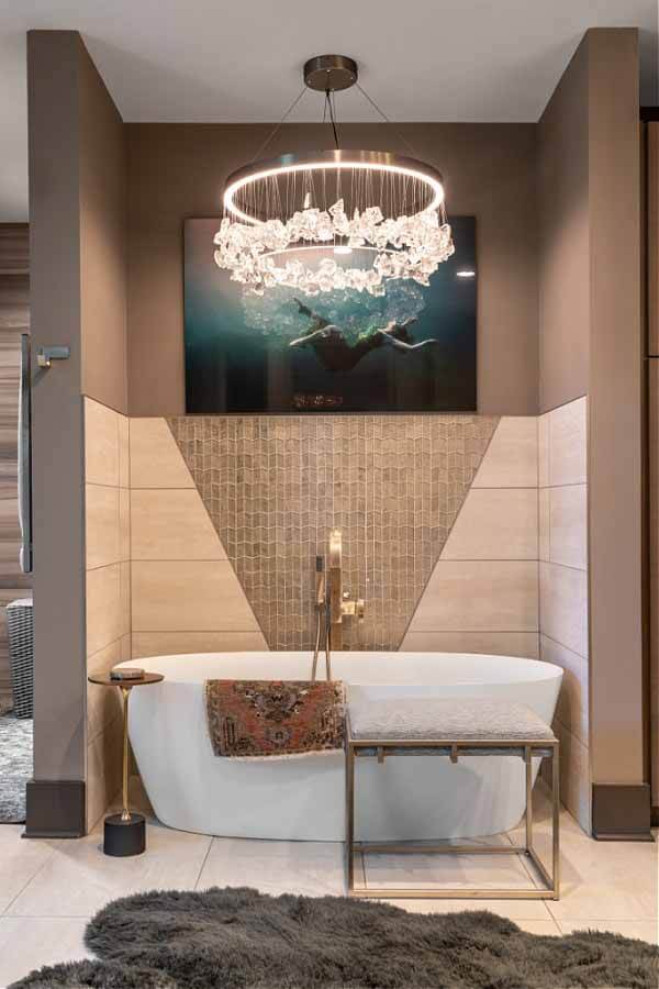
A freestanding tub tucked into a beautifully designed alcove provides a mini spa experience in the master bathroom. You can check Bathroom tiling service.
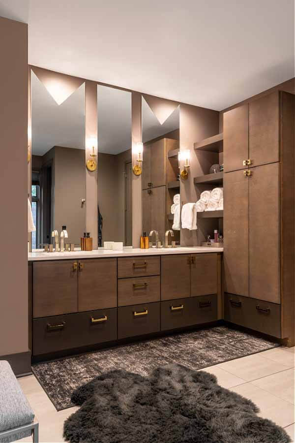
“I had three mirrors that were different sizes,” explains Jessica, “so I had a ‘V’ cut out of the top of the mirrors. In the middle, we just left it from the counter surface to the ceiling. I wanted to mimic the ‘V’ behind the tub — it’s that same shape above the vanities.”
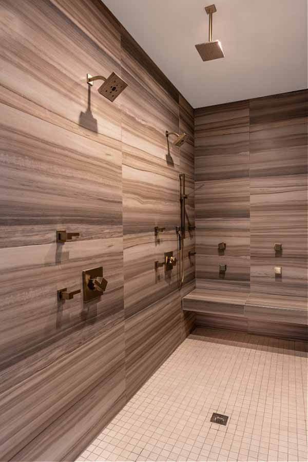
This walk-in his-and-hers shower has us swooning. Not to mention, it’s “zero-entry,” meaning there’s no door. Talk about a contemporary upgrade!
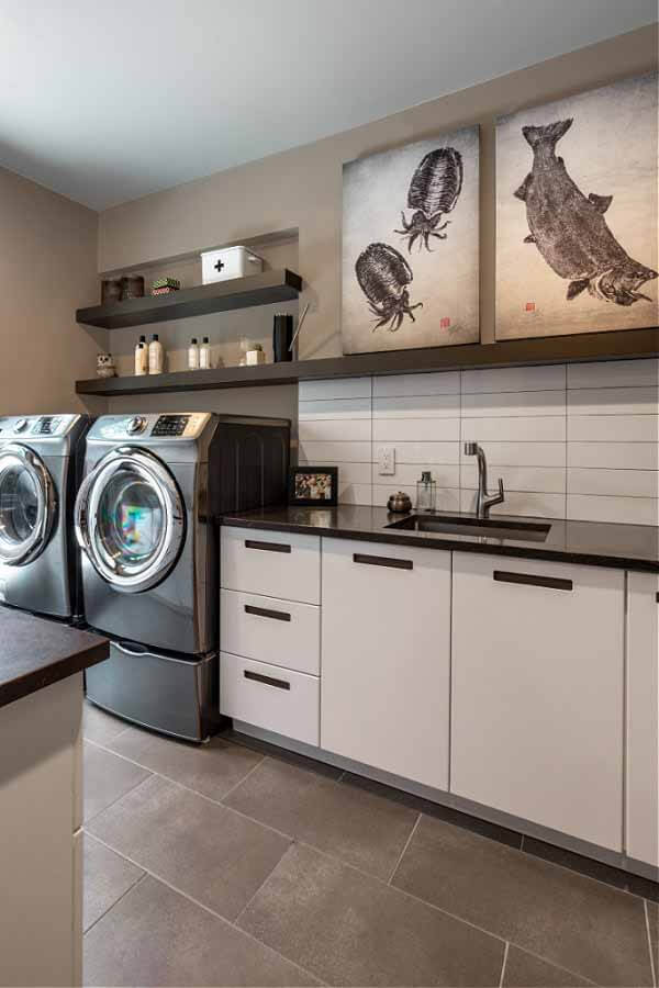
“To save on cost, we ended up doing IKEA cabinetry for their mudroom and laundry room,” says Jessica. “It looks great, but from a design perspective, it was really challenging.” Thankfully, the completed look makes it all worthwhile.
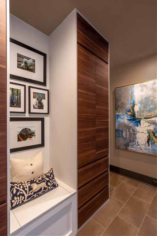
Walnut veneer and white lacquer-sided IKEA cabinetry bookends this sweet little mudroom reading nook that displays photos of the homeowners’ beloved pups.
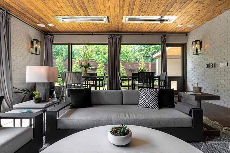
With a view of the gorgeous landscaping, the sunroom is both fun and functional, with ceiling heaters, a huge television, stained concrete floors and a cedar plank ceiling.
Photos by Reagen Taylor Photography.
**********
See more gorgeous homes in our archives.
